- EPA proposes tougher downwind pollution rule as Senate votes to block Obama climate plan
- For today: Please give me a one-page description of your plans
for your final project (just so that I have something). Then I can
begin to make targeted suggestions.
- I've been working on my report(s), and I hope that you are too!
- USAToday levels. 50 values, and here is their distribution:
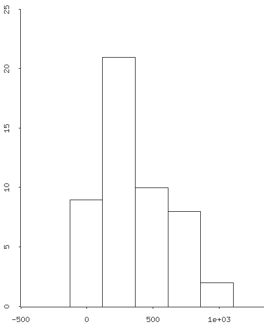
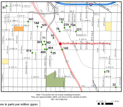
This gives us a (somewhat biased) picture of the lead situation throughout Newport, although multiple samples were taken from individual properties (and we're not sure how they were selected -- suspected hot? suspected cold?).
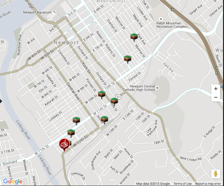
- Here are my (nearly final) analyses and results for the Newport lead study:
- Minnesota (one final nail?)
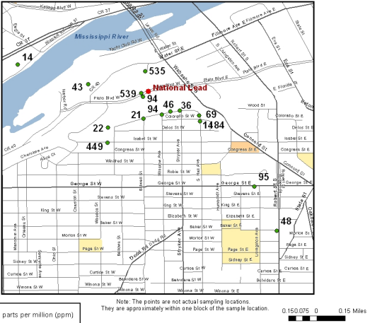
- The data
-
If we have the surveys, then we'll check several of the forms where
there was some discrepencies, to decide on whether to accept them or
not.
Surveys Forms 23, 24, 43 (W or X); and Form 27, which appears to be from Covington.
- Pascal's triangle is critical for
understanding proportions
- Preliminary survey results (awaiting synchronization):
 (A1 Provide
 (A2 Safe
 (A3 Eat/Ex
 (A4 Someone
 (A5 Community
 (A6 Hope
 (B Age
 (C Gender
 (D Newport

	All:
(((a d sd sa) (26 4 5 18))
 ((a d sa sd) (32 8 11 2))
 ((a d sa sd) (32 11 8 2))
 ((d a sa sd) (3 21 26 3))
 ((a d sd sa x) (30 15 3 4 1))
 ((a d sa x sd) (24 3 24 1 1))
 ((50 31 16 15) (13 21 14 5))
 ((m f x) (21 28 4))
 ((w e x) (25 21 7)))
	Westside:
(((a d sa sd) (16 3 5 1))
 ((a d sa sd) (15 5 4 1))
 ((a d sa sd) (16 6 2 1))
 ((d a sa sd) (1 12 11 1))
 ((a d sd sa) (11 7 3 4))
 ((a d sa sd) (13 2 9 1))
 ((50 31 16 15) (4 11 7 3))
 ((m f x) (11 13 1))
 ((w) (25)))
	Eastside:
(((d sd sa a) (1 3 10 7))
 ((d a sd sa) (3 11 1 6))
 ((a d sa sd) (12 3 5 1))
 ((a d sa sd) (5 1 14 1))
 ((d a) (7 14))
 ((d a sa x) (1 8 11 1))
 ((16 31 50 15) (4 10 6 1))
 ((f m x) (12 8 1))
 ((e) (21))
- The normal distribution: probabilities often come down to
- Transforming data to a normal distribution, then
- Computing a Z-statistic from a normal distribution:


A "Z table"
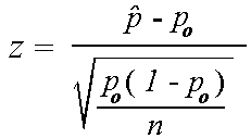
- A Z for a proportion:
