- We need to finish surveying: what's the plan?
- Haley and Sandra
- Marisa and Melody
- Homework from Monday:
- You were to use weighted averages for the
"pseudo-532" measure (weighted by what?), as we discussed
in class.
Grace did something that I hadn't thought to do, and I think that she may be on to something...
- I mentioned in the assignment that owner-occupied housing is a "percentage", but some of you used the raw values.
- If you wish, you may resubmit your work, with modifications. Please do so by Friday. If you want your homework back, to modify, you may have it to work on. I have a record that you've submitted, and may revise.
- By the way, for this analysis it doesn't matter which kinds of dollars you use for the median income -- 2013 dollars or dollars of the time. Moran's I is insensitive to a "linear scaling".
- You were to use weighted averages for the
"pseudo-532" measure (weighted by what?), as we discussed
in class.
- Reminder that you have homework due today and Friday:
- For today: Finish the data set of physical locations
and estimated lead levels for the Newport Foundry location.
Please submit these in electronic as well as paper form.
Use the Grace/Sandra method of weighted averages, if you wish, or create a method of your own (although indicate why you think it superior to the Grace/Sandra method).
We'll continue talking about estimating lead levels today.
- For Friday: Submit your coordinates for the Newport sites from the USAToday study (please submit electronically, as well).
- For today: Finish the data set of physical locations
and estimated lead levels for the Newport Foundry location.
From these locations and samples, we seek to estimate at neighboring locations. How should one do this? This is the fundamental question which we wish to consider.
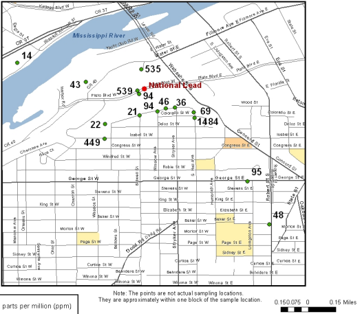
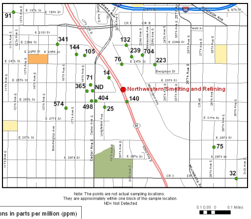
- We need to get physical coordinates for the lead data in
the vicinity of the smelter (Newport Foundry Inc) from
the EPA study. (Why is the "1 inch = approximately 25
feet" a bad idea on this map?) We need to estimate
corresponding lead levels at each location.
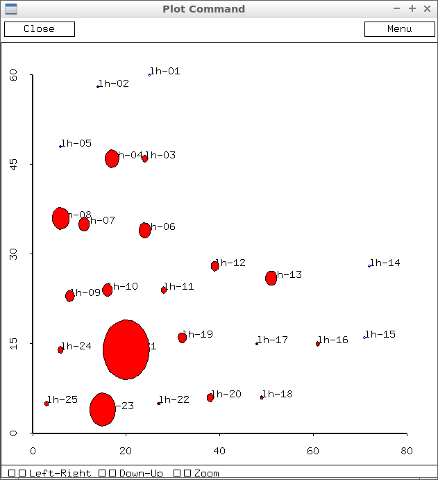
This graphic was generated using lead values from the GraceSandra method.
- We need to get physical coordinates for the lead data in the Newport vicinity of the smelter from the USA Today study. We need to estimate corresponding lead levels at each location.
- We can construct a soil lead profile, based on the tests at different soil levels.
- We can construct distributions of lead levels in different ways (by soil depth, say, and for Newport as a whole).
- Finally we need to consolidate this into a summary report. You will either report on this problem or on the survey results for your final project.
- The USA Today website has some (limited) data which we can use for
the Newport area
(via their "dig
deeper" link). Today we want to talk about how to get at the lead
values.
But there are other things to talk about from that study.
It motivated another class in the Project Hope initiative, of which Ellen Keener was a member to write the following report. Ellen Keener was kind enough to tip me off to the existence of the Superfund report.
One of the students on this project went on to write the Enquirer article which just came out.
- The Superfund Final
Report (KY EPA), which examined lead levels specifically around the
smelter (Newport Foundry) is what we are currently examining.
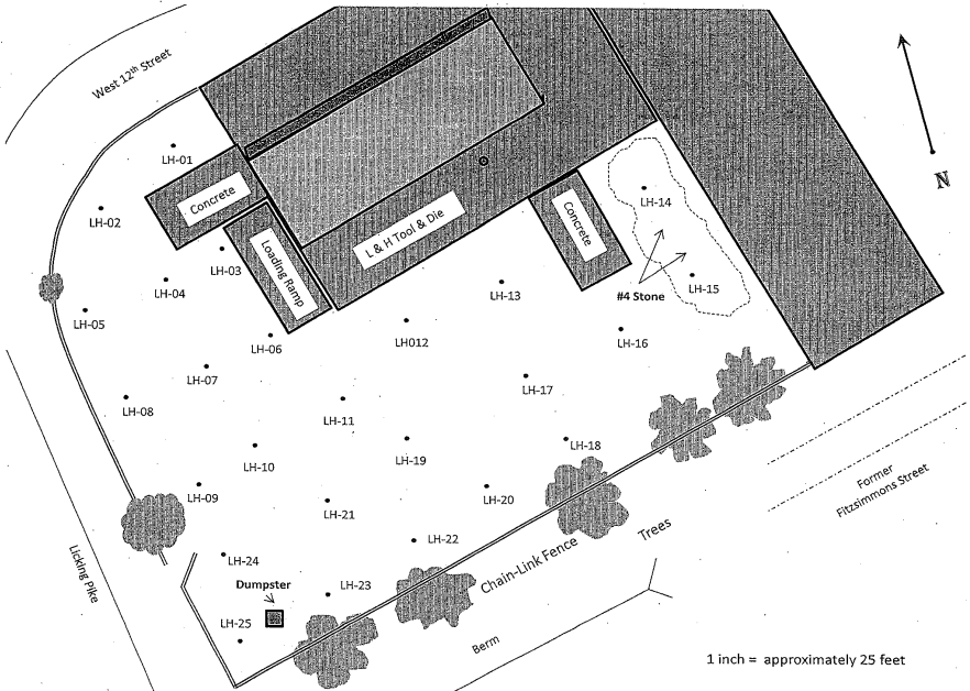
Last time we began using a grid to get coordinates for data locations we have. Try to check with your classmates, to make sure that you're getting consistent results.
We'll need to get coordinates for the USA Today study, too, so let's get some reference points for that one, too, before we go on.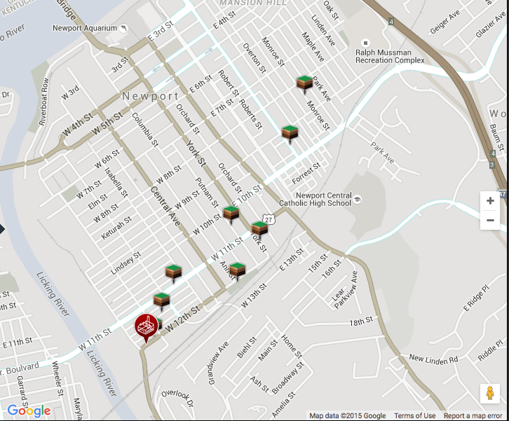
We're using the KY EPA lead data to
- map the yard around the former smelter, and determine a "lead load" in the immediate vicinity of the smelter, and to
- get a "soil lead profile" -- since we have multiple lead levels at
each site. So let's talk about this one today. It will help us to get
an answer to the previous problem.
Last time we were talking about this problem. How do we generate the soil lead values for the sites we've identified? I suggested a method for getting started: the idea was that we were going to put all our samples together into one, to get an idea of how soil lead level changes with depth. We have an idea of what to expect.
Let's think of a simple example, and see how it would work: three samples, as follows:
- Sample 1:
- 0-1: 49
- 1-2: 23
- 2-3: 17
- Sample 2:
- 0-1.5: 123
- 1.5-2.5: 90
- 3-4: 47
- Sample 3:
- 0-1: 220
- 1-3: 71
I'll now have you record the data in this way, using your sheet from the KY EPA. Take out your data sheet: we're going to mark it up.
In the end, we'll get results that look like these. Let's take a look at my work.
To do:
- Can you verify my work in that result file?
- Can you think of a better way to represent the data?
- Now: how would you estimate the lead value at each site, perhaps including this analysis? As Kensey said last time, "So there's no right answer...." -- and she is correct! There's no right answer -- there are only reasonable answers, and we could then debate how reasonable each is!
- Sample 1:
- I did a search of lead pollution
patterns, and found
this interesting study and the associated graphic:
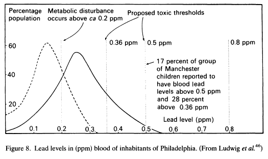
The dashed curve is suburban males; the solid curve is urban males.
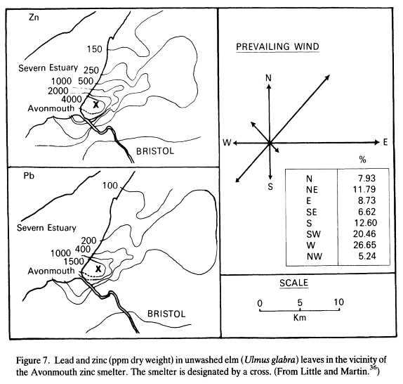
- I also did a little further study of the USAToday report. There
were smelters nearby in Cincinnati, upwind from Newport. They, too,
could have contributed to Newport's lead load.
- USAToday report tipped me off
- to this site in Cincinnati (by the way, Certified Metals also owned the Newport Foundry site at one time).
- It is important that we determine prevailing winds for Newport:
- A crack at Prevailing Winds