Lab: Variograms and Kriging
This lab is an introduction to the geostatistical way of
mapping. There are two versions of this lab: the Geo-EAS
version and a GS+ version (this one). The first is unix software, while
the second is Windows software.
There are two separate, and very important topics of this lab,
reflecting the discussion of the geostatistics module. The first is variography, the
study of spatial autocorrelation in a data set using the variogram; the
second is kriging interpolation, or the creation of grids (maps) from
scattered data.
While many software packages such as ArcView offer you the
possibility of interpolation, we must be wary of it for several reasons:
- interpolation of the data may be nonsensical, and
- the method of interpolation may be entirely inappropriate for the
spatial autocorrelation implied by the data.
Lab Objectives:
In this lab, you will
- use ArcView and its Spatial Analyst Extension to
- load in the Illinois Cancer Data,
- interpolate the data, creating contour maps of the results.
- use GS+ to
- model the spatial autocorrelation in the Illinois Cancer data
set (or, even better, your own data set) using variogram analysis,
and
- create kriged maps of a variable using the results of your spatial
autocorrelation analysis.
- use ArcView to
- load the gridded data created by GS+,
- create a contour map of the GS+ data to compare with the map
created by ArcView.
Lab
ArcView your data:
- Data:
- If you want to use your own
data...
- If you don't have data of your own, you'll need to
download
ill.csv, a new
UTM (Universal Transverse Mercator coordinate) version of the Illinois
disease data, and the utm shape
file for the Illinois county maps. Use WinZip to extract the zipped
files to your machine or personal space (make a note of the directory where
you put them).
- Fire up ArcView, and add the utm theme to your view.
- Now you'll want to add a
table - the
ill.csv file - which you do from the Project window (or table window). ill.csv is a
Comma Separated Value file, and hence text.
Once you've added the table, you can "Add Event Theme" to the view, which
you do from the View menu of the View window. Make sure that you use the X
and Y variables for geographic coordinates, rather than lat and long (which
will be ArcView's default choice). The X and Y in the file are in UTM
coordinates.
- Have a look at the map and the data, to make sure that all is
well.
- From the Project window, we want to open the File menu and add
an ArcView extension. Select Extensions, then check the checkbox for Spatial
Analyst. Doing so will add a number of menus to the View Window menubar.
- Making Contours: before you do anything else, save
your project. The next step has been known to cause ArcView to bomb
out.
- Back to your view, select the
ill.csv
theme. Now select "Create contours" from the Surface Menu. Take all the
defaults: the only place where you will have to change a selection is in the
"Interpolate Surface" Z Value Field: by default it will be on "Lat", whereas
you want to choose scv1 (scv1 was one of the synthetic cancer
variables created by Jacquez, et al. via Principal Component Analysis of
the cancer data set).
Other than that, just hit "Ok" buttons! ArcView will
process your request, interpolate the data, and add the contour theme to
your view.
- If ArcView bombs out on you, your contour may have
been created anyway, in C:\TEMP. Have a look to see if a contour shape file
has been created there. Hopefully it has, in which case you can simply start
ArcView again, open your project, and add in this shapefile. It's the
painful way....
- As usual, you can double click on the contour legend to
change from Single Symbol to "Graduated Color", choosing contour value as
the variable. Do the same for
ill.csv, so that they use the
same scheme (you can edit the categories of ill.csv to match
those of contours of ill.csv).
Let's jump now to GS+. GS+ is commercial geostatistical software,
available from BioMedware for a hefty fee;) Fortunately, there is a demo
version available over the net which you can use. The features that are
blocked out of the demo version are not critical to the demonstration of
geostatistical properties (you can't print, or save parameter files).
GS+ provides access to the geostatistical approach to the same
problem of creating a map. The big picture here is that, rather than making
ad hoc and generally inappropriate assumptions about the spatial
autocorrelation evidenced in the data, we are incorporating a model of it
into the interpolation process via the variogram. More information should
result in better maps.
Interpolation like ArcView's IDW (Inverse Distance Weighting)
actually makes an assumption about the spatial autocorrelation - it's just
based on a whim. It does not reflect (except by chance) the realities of
your data, and the process you are studying.
Variogram modelling is the crucial step in which we analyze and
model the spatial autocorrelation structure. If your project data lend
themselves to this kind of analysis, then by all means take some time before
you're done with your projects to check out the spatial autocorrelation
via its variogram structure. In the meantime, we'll practice on the illinois
data.
- You'll need a modified version of the data,
ill.txt, to load (simply) into GS+ (you could load
ill.csv, but it's a little more painful - you have to specify
some additional import options). There are a few differences: the first
line contains a title (for plots, etc.), the second line (containing the
variable names) is comma separated, while the data are separated by
spaces. I also dropped the county names, as they caused problems when
loading.
- If GS+ is not available (it should be on our computers via
Start -> Course Software -> Public Health -> Epidemiology 624 -> GS+ for
Windows (Demo Version)
if all is well), you'll need to download the
demo software from the GS+
site. Download the NT version, and double click on the GSDemo.exe file
to install. The executable is called GSWin32Demo.exe, in case you need to
search for it.
- Fire up GS+. On the "Data Worksheet" which pops up, there is an
"Import file" button. Hit it, and choose the
ill.txt file,
wherever it may be.
- You will see that, by default, the first three columns are
chosen as the x, y, and z columns. In our data file, the x and y coordinates
are at the end. Go to those columns, and click on the top line of each
column with the mouse, set the column to either x or y as appropriate, and
click the "Ok" button.
- For the Z variable, let's start with scv1, which is what you
saw in the geostatistics module. Click on it as you did
for x and y, but choose it as your z variable.
- The first thing to do is check the variogram. This can be done
in several ways. Under the Autocorrelation menu is "Semivariance Analysis":
click that, hit the calculate button, and what you see should be very
familiar (from the geostatistics module).
- To see the model, check the "Show Model" checkbox under
Variogram options; then check the "Show Sample Variance" checkbox as well
("the sample variogram is a spatial decomposition of the sample variance").
Remember the distinction: the boxes that the model is fitting make up the
sample variogram; the model represents the theoretical variogram which
captures - or attempts to capture - the spatial autocorrelation in the data
set.
- Now you can begin to play with some of the options. For
example, you can:
- click on one of the lag boxes in
the variogram plot, to see all the pairs (their distances and the difference
squared of their values) which contribute to that particular lag class
(remember that with scattered data, we need to lump together pairs that are
approximately the same distance apart);
- change the lag size: do this by replacing the "Uniform
Interval" in the upper left of the window. Cut it in half, for example, to
double the number of lag classes.
- Click on Model (then hit Refit - there's a bug which
causes the nugget to display as zero). You can now see the options of other
models to fit. Try the Gaussian, for example. Whoa! Quite a difference. It
has a range of only 30 kms, and a very small nugget.
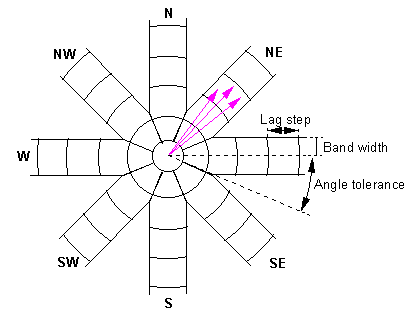
- the directional variograms are shown running at
0, 45, 19, and 135 degrees, encompassing 45 degrees pie slices of the
data. For example, the 0 plot includes all pairs that are separated an angle
of from -22.5 to 22.5. Perhaps this figure
will help you understand. Change the principal axis (in the upper middle) to
22.5 and hit the calculate button. You will see a different grouping of the
four slices. How is the fit?
- Just to compare the results from the geostatistics module (using the
default exponential model) to something else, accept the isotropic Gaussian
model. We'll now try kriging using this model.
- Click on the Krig menu and select "Punctual Kriging"
(point kriging). Make sure that you're using an isotropic Gaussian model.
You'll see that the number of neighbors to use is set at 16: that means that
we'll be doing local kriging, rather than global kriging. There is also a
search radius specified: only points within that radius would be considered
for selection as neighbors.
- We're going to krig to a uniform grid. Hit the
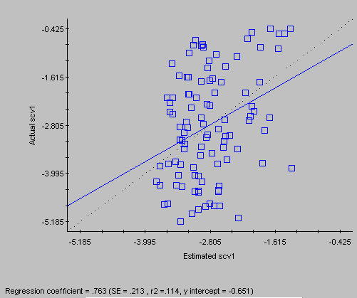
calculate button. Once it's done processing, click the Cross-Validate button
to see the plot of true data versus the data values estimated using the
"leave one out" procedure. How does it compare with the cross validation results of the geostatistics module? [The
estimates are certainly more variable.... Remember that we would like for
plot to cluster strongly about the dotted y=x line, although any model with
a nugget will automatically fail in this regard. (Do you remember the practical implication of having a
large nugget in a variogram model?)]
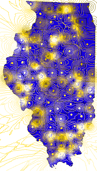
- Now click on the Map menu item, choose 3-d, and hit the
Draw button. Do you see the "snow capped peaks"? This map should look more
like the map of IDW that ArcView came up with,
because the nugget term is so small. Remember, small nugget means more
confidence in neighbors, and a tendency of the map to rise up to meet their
values as they are approached in space.
- Try a 2-d contour map as well, from the Map
menu. Perhaps view the standard deviations, rather than the Z values
themselves.
Okay, it's time to move back into ArcView land. We want to load the kriged
grid into ArcView, create a contour map of it, and compare that map to
the map produced by ArcView in the first step of the exercise.
- You need to add the grid file produced by GS+ as
before. Before you do so, however, you will need to strip off part of the
header of the .krg file. Recall that ArcView requires a delimited (comma or
tab) line of variable names, and then delimited values. The first several
lines of the .krg file need to be removed, to get down to the variable names
and values. Edit this file using your favorite text ASCII editor
(e.g. Notepad).
- Now follow the same directions
you did at the beginning to create a contour map of the kriged data. Again,
bombing out is a possibility, so save your project first....
- As usual, you can double click on the legends of the two
contour maps to change from Single Symbol or Color to "Graduated
Color". Choosing the same color scheme for both the ArcView contour file and
the krigged data (you can edit the categories of one to match the
other). This makes it easier to compare the two maps.
Include the ill.csv theme and the two contour plots in
your view. Flip one contour off and the other on, to see how differently
they've mapped the data. As you see here, and as you saw in the geostatistics module, the
results can be wildly different!
Why would you choose between one map or the other? If one seems to
"trust the data" less, why is that?
- Please
evaluate this lab. We appreciate your comments!
Optional exercise (for the curious, highly motivated among you):
- If you want to see an amusing example of spatial
autocorrelation in the data, invoke vario again and have a look at the
variogram of a variable like lat or long. You'll notice a very
striking variogram - can you explain it?