Exponential Functions
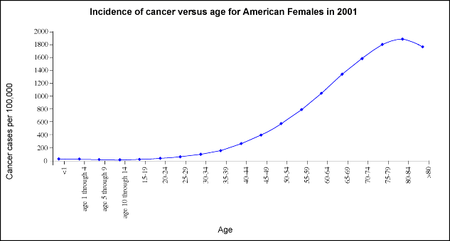
Graphing experimental data might reveal exponential growth or decay. Exponential Growth Exponential functions play key roles in modeling many natural phenomena. Such models are based upon empirical data. For example, most people know that their chances of getting cancer increase as they age. In fact, by looking at data complied by the National Cancer Institute you can readily see that incidence of cancer increases dramatically between the ages of 35 and 80. Look at this data for incidence of all cancers in females from 2001:
Notice that the incidence of cancer nearly doubles every ten years between the ages of 20 and 75. If we graph this data with age on the x-axis and cancer incidence per 100,000 people on the y-axis, you can see that cancer incidence appears to increase exponentially until age 75.
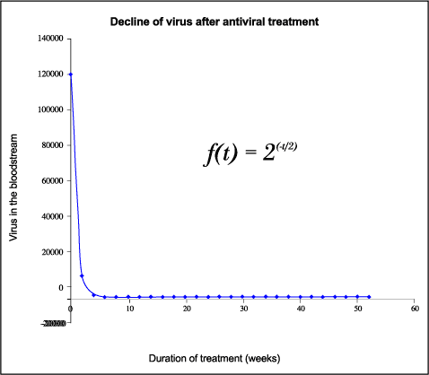
Exponential Decay Human immunodeficiency virus (HIV) can now be controlled using a combination of powerful antiviral drugs. Upon treatment, the amount of virus in the bloodstream of infected patients falls rapidly then plateaus to levels that are difficult to detect with standard laboratory techniques. The following hypothetical data models the typical course of infection for a patient taking a regimen of antiviral drugs for one year.
If you plot duration of treatment on the x-axis and viral load on the y-axis, you can study how the amount of virus in the bloodstream diminishes over time.
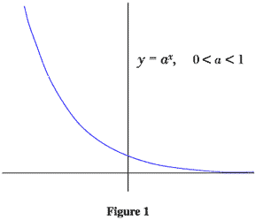
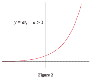
By inspecting this graph, it appears that the overall amount of virus in the blood stream exhibits approximate exponential decay during drug treatment. Virologists and mathematicians have collaborated to describe viral dynamics and calculate the half life of virus in the blood stream in the presence and absence of various drugs. What does the graphical representation of y = a x, look like?
To be accurate in sketching y = a x, we need to know the exact value of a. In particular, if a is much greater than one (or much less than one) the exponential function will grow (or decay) very quickly.
In the next section we will summarize these results and focus on graphing specific exponential functions by looking at two representative examples. |
||||||||||||||||||||||||||||||||||||||||||||||||||||||||||||||||||||||||||||||||||||||||||||||||||
The Biology Project > Biomath > Exponential Functions > Graphical Representation
Department of Biochemistry and Molecular Biophysics
The University of Arizona
December 2005
Contact the Development Team
http://www.biology.arizona.edu
All contents copyright © 2005. All rights reserved.